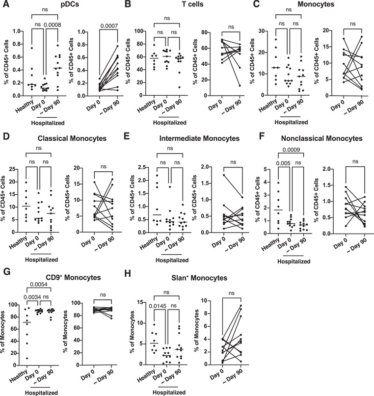
FIGURE 6.

Comparison of immune cell cluster frequencies in hospitalized COVID‐19 patient blood through time and characterization of CD9+ monocyte cytokine release. PBMCs from healthy (n = 8) and SARS‐CoV‐2‐infected hospitalized (n = 11) individuals collected at the initial blood draw plotted in Figure 1(A) (Day 0) or approximately 3 months after initial blood collection (∼Day 90). CyTOF files were gated in Flowjo as shown in Figures S4 and S5. Relative changes in immune cell frequencies between healthy, hospitalized at Day 0 and hospitalized at ∼Day 90 PBMCs were calculated using GLMM and displayed in box and whisker plots (A–H). Statistically significant (p ≤ 0.05) changes calculated using one‐way ANOVA with Tukey's post hoc test for the comparisons between healthy, Day 0 or ∼Day 90 hospitalized subjects or Welch's T‐test for the comparison between only Day 0 or ∼Day 90 hospitalized subjects
