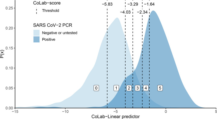
Figure 2.
Probability density plot of the CoLab linear predictor. The probability density plots for patients with COVID-19 (dark blue) and those without COVID-19 (light blue) are plotted against the linear predictor (see table 2). The CoLab-score cut-offs (−5.83, −4.02, −3.29, −2.34 and −1.64) are depicted with vertical dashed lines. The white-boxed numbers (between the cut-offs) represent the corresponding CoLab-score. Note that while the area under both curves is identical (since these are probability density functions), in absolute numbers the ‘negative or untested’ group is about 36 times larger than the PCR-positive group.

