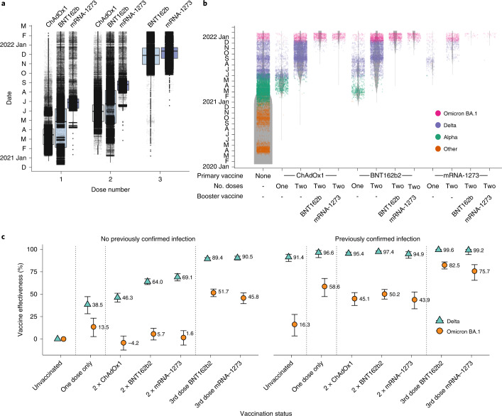
Fig. 4. Vaccine deployment and vaccine effectiveness.
a, Boxplots of date of first, second and third administered vaccine dose by vaccine product for the population of NHS GG&C aged 18 years and older. The box limits are the quartiles and the centre line is the median, with whisker length of 1.5 times the interquartile range. Outliers are shown as dots outside the whisker range. Data points are overlaid as a dot plot with points shown as black dots, with a random jitter along the x axis applied for visual clarity. b, Denominator (violin) plot showing populations of test positive and test negative cohorts in NHS GG&C, with the widths of the grey bands representing the populations in each group at each time point. VOC classifications of sequenced cases are overlaid as a dot plot, with points coloured by their VOC and a random jitter applied along the x axis for visual clarity. c, Error bar plot of estimated vaccine effectiveness against testing positive for Delta and Omicron BA.1 SARS-CoV-2 infection in the population of over 18 years in NHS GG&C who were tested between 6 and 26 December 2021. The points and corresponding numbers represent the estimated vaccine effectiveness (%) for each group and for each variant, with the error bars representing 95% confidence intervals.

