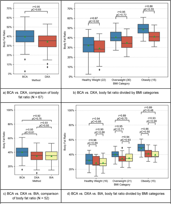
Figure 2.
Comparison of BFR between BCA (blue), DXA (red) and BIA (yellow). In the plots (a,b), BCA and DXA are compared separately because more patients received PET/CT- and DXA scans. Patients with all three measurements available are compared in plots (c,d). The boxplots represent the distribution of the patient’s BC measurements. The mean is indicated with a green triangle and the outliers are indicated with a rhombus. The samples are compared using Pearson’s r correlation coefficient (r) and Lin’s concordance correlation coefficient (ρC).

