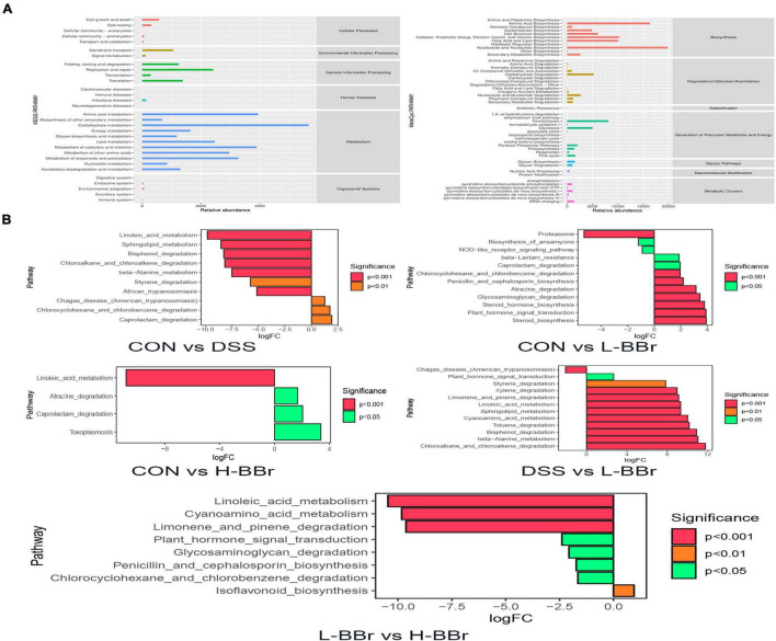
FIGURE 5.
Potential biomarkers and correlation analysis. (A) The KEGG (left) and MetaCyc (right) functional pathway abundance map. The X-axis stands for relative abundance, and Y-axis represents function class. (B) The X-axis represents logFC[log2(fold change)], the positive value represents up-regulation of group (B) relative to group (A) the negative value is down-regulation, Y-axis stands for function class.

