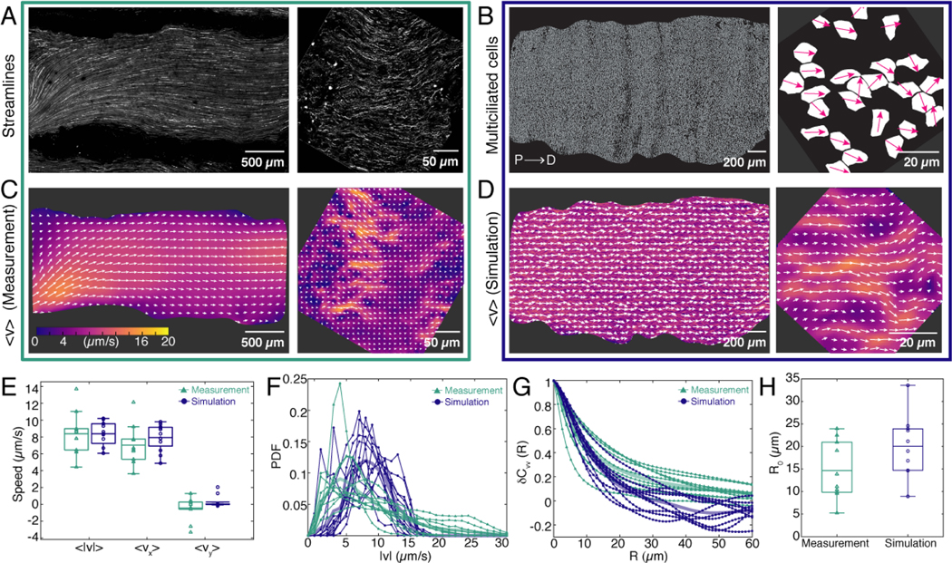
FIG. 2. Measurements of ciliary flows at the tissue and cellular scales.
A. Pathlines of the flow generated by multiciliated cells across the entire trachea (left). Right: Pathlines of the flow visualized at a scale comparable to the wavelength of the cilia patchwork pattern. B. Binary images obtained from thresholding the images of multiciliated cell localization shown in Fig. 1B,C (left panels). White regions represent multiciliated cells. Right: Magenta arrows show the average orientation of cilia within each multiciliated cell measured from Fig. 1C. These coverage and orientation fields are used as input for the model, shown in panel D. C. Representative experimental flow fields measured at the scale of the entire trachea (left) and with micrometer resolution (right). Colours show the flow velocity magnitude and white arrows indicate the streamlines. D. Simulated flow fields, using the experimental data of panel B as an input.Colours show the flow velocity magnitude and white arrows indicate the streamlines. E. Comparison of flow speeds between experiment (green) and model (blue). The majority comes from the x component. Boxplot central mark indicates the mean, and the bottom and top edges of the box indicate the 25th and 75th percentiles, respectively. F. Comparison of the flow magnitude distribution, PDF , between experiment and model. Thin lines show the PDF from a field of view of the size shown in C,D (right). Thick lines are the average of all flow fields analyzed. G. Comparison of the spatial autocorrelation function between experiment and model. Thin lines show measurements from a field of view of the size shown in C,D (right). H. Comparison of correlation length R0 from the experiment, , and from the simulation, .

