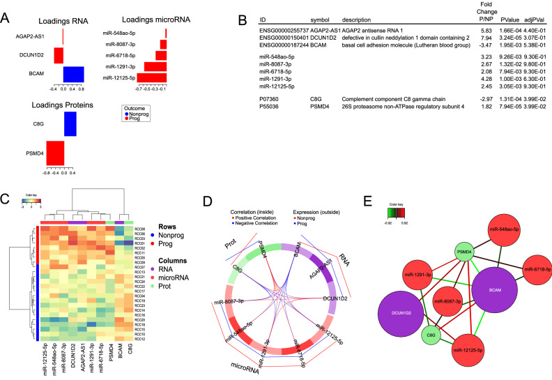
Figure 4.
Disease progression signature. For the visualization of the molecular signature, the loading plot (A) represents the loading weights of each variable on component 1 of the multivariate model. Most important variables, according to absolute values of their coefficients) are ordered from bottom to top. Colors indicate the class for which the mean expression value is the highest or the lowest for each feature. In (B), the features of the model are shown, listed according to the loading plot in (A). In (C), the Clustered Image Map (CIM) demonstrates that the expression values of the 10 features of the model yield two clusters of samples (rows) and two main clusters of over- and underrepresented features, by employing Euclidian distance and Ward´s linkage. (D) Pearson correlation of the expression values of the features, as visualized by a circosplot, with cutoff 0.07. Positive correlation in red, negative in blue. The outer lines indicate whether the featured marker is expressed to a higher (red line) or lower (blue line) extent in NP, as compared to P. The Relevance network in (E) demonstrates the correlation structure between variables shown in (D) (cutoff 0.7), where positive correlation is depicted in red and negative correlation in blue. The similarity value between a pair of variables is obtained by calculating the sum of the correlations between the original variables and each of the latent components of the model.

