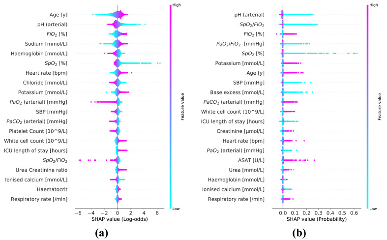
Fig. 4.
Summary plots for the SHAP values constructed from both logistic regression (a) and random forest model (b). Each SHAP value is represented by a single dot on each predictor row. Color is used to display the corresponding value of the predictor. Predictors are ordered by the mean SHAP magnitude. (For interpretation of the references to colour in this figure legend, the reader is referred to the Web version of this article.)

