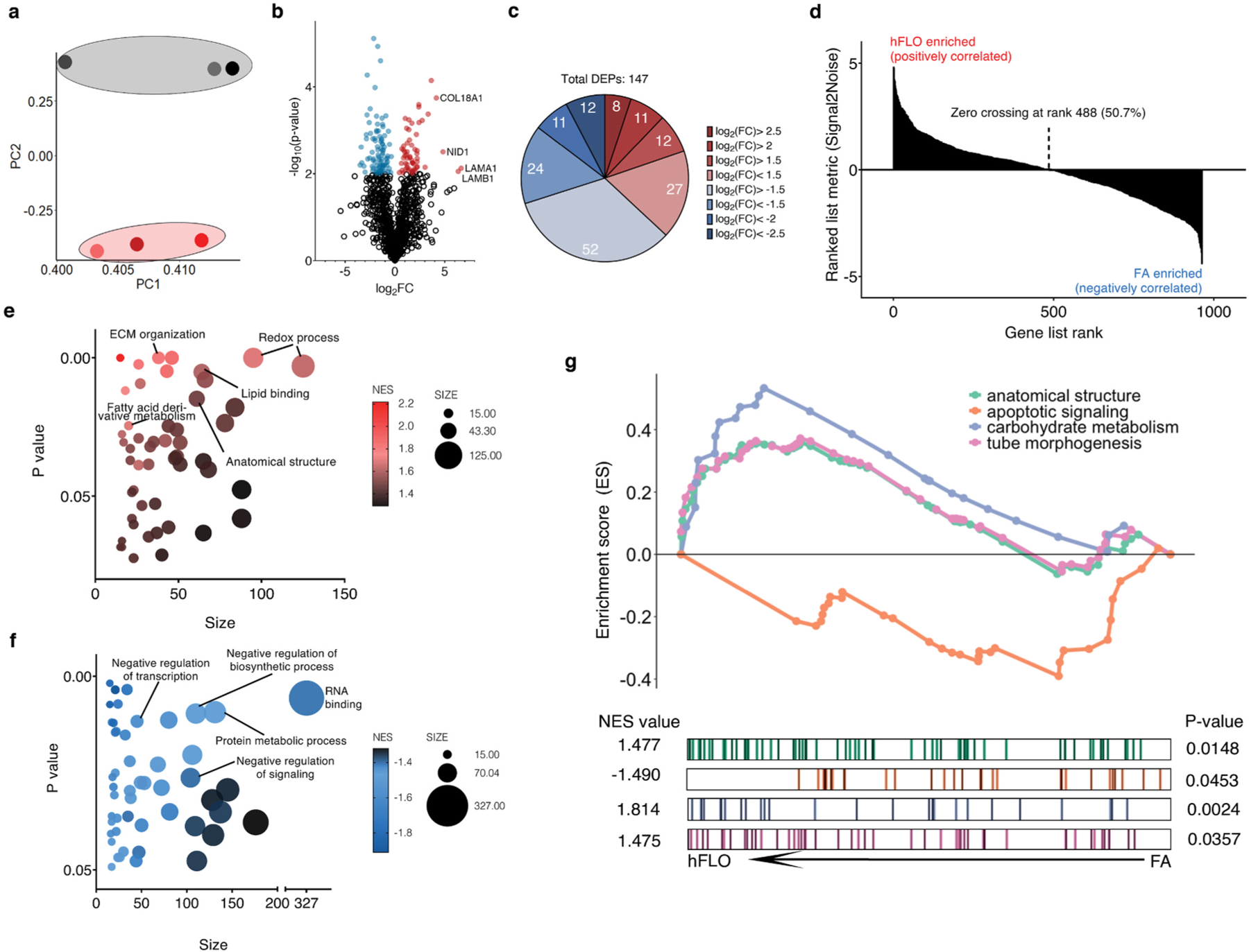
Fig. 4.

Shotgun proteomics. a, Principal component analysis plot of the first and second components. Dots represent the whole proteome of three independent samples used for FA aggregates (grey) and hFLO (pink). Grouping is highlighted using an enclosing oval. b, Volcano plot showing fold changes (log2FC) of hFLO versus FA aggregates. P values were calculated using two-tailed t-tests with Welch’s correction. Red points indicate proteins with P < 0.01. c, Distribution of the differentially expressed proteins (DEPs, P < 0.01). d, Gene set enrichment analysis (GSEA) plot of all proteins ranked based on enrichment score (Signal2Noise). e, Scatter plot of the top 50 GO-Terms enriched in hFLO. Dot size corresponds to number of genes annotated per term and color corresponds to the normalized enrichment score (NES). f, Scatter plot of the top 50 GO-Terms enriched in FA (negative enrichment in hFLO). g, GSEA enrichment plot for selected GO-Terms. Barcodes show individual proteins annotated in each GO-Term and their respective ranks based on enrichment of hFLO versus FA. (For interpretation of the references to color in this figure legend, the reader is referred to the Web version of this article.)
