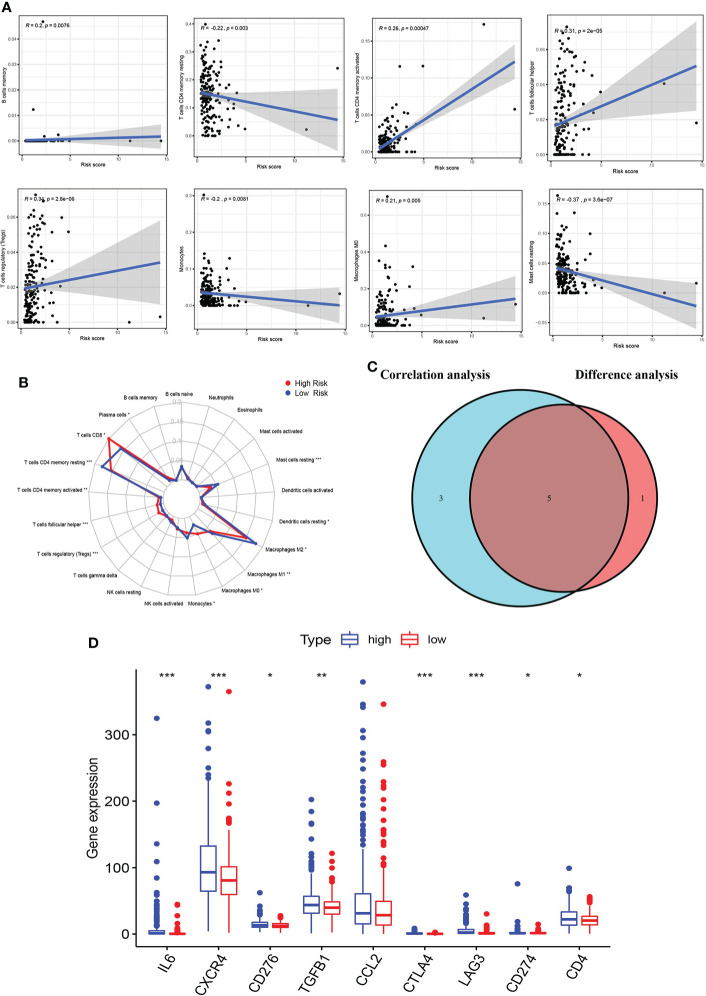
Figure 8.
Correlation of immune microenvironment with risk score. (A) Scatter plot showing eight significantly correlated TICs (p < 0.01). The blue line in each plot was a fitted linear model indicating the proportion of tropism of the immune cell along with risk score, and Pearson coefficient was used for the correlation test. (B) Radar plot showing differences in TICs between the high- and low-risk groups as measured by Wilcoxon rank-sum test. (C) Venn diagram showing that the 5 TICs were associated with the risk score jointly determined by the difference and correlation tests shown in the scatter and radar charts, respectively (p < 0.01). (D) Box plot showing the correlation between immune checkpoint and risk score. The meaning of the symbol *** is p<0.001.

