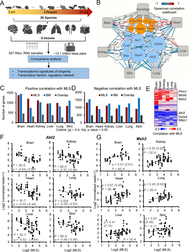
Figure 1. Comparative transcriptomics of 26 mammalian species.
(A) Schematic workflow showing the comparative transcriptomics of 26 species with distinct MLS.
(B) Network plot showing the Neg-MLS and Pos-MLS genes overlapped with GenAge database. The node size (count) indicates the number of tissues in which the genes were significantly correlated with MLS. The color of connecting lines corresponds to the Spearman correlation coefficient. Orange circles showing representative Pos-MLS genes. Blue circles showing representative Neg-MLS genes.
(C-D) Barplots showing the number of genes for which expression levels positively (C) or negatively (D) correlate with MLS, body mass or both.
(E) Heatmap showing the Spearman correlation coefficient of Neg-MLS and Pos-MLS genes across tissues.
(F-G) Scatter plots showing the relative gene expression levels of Akt2 (F) and Msh2 (G) in six tissues across species. Spearman correlation coefficients (ρ) of gene expression and MLS are shown in the plots. Correlation coefficients for phylogenetically corrected (PIC) data are shown in parenthesis. P values were shown for the Spearman correlation coefficients. All the P values were adjusted for multiple tests with BH method.
See also Figures S1–2 and Table S1

