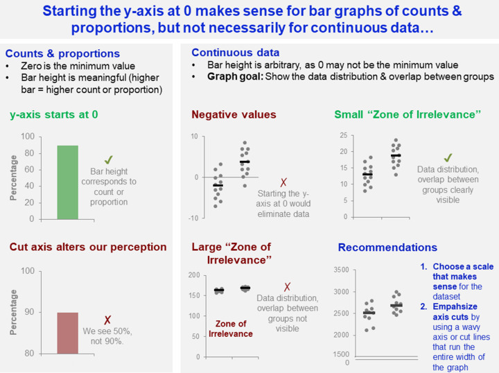
Figure 10. Starting the y-axis at 0 makes sense for bar graphs of counts and proportions, but not for continuous data.
This figure examines how the differing characteristics of counts and proportions vs. continuous data, effect decisions about whether to start the y-axis at 0. Cutting the axis is potentially problematic for counts and proportions, as this alters viewers’ perception of the count or proportion. In contrast, selecting a y-axis scale that does not start a zero may be essential for continuous data if the dataset includes negative values, or a large portion of the graph is taken up by the ‘Zone of Irrelevance’. The ‘Zone of Irrelevance’ refers to a region at the bottom of the graph that does not contain data points.

