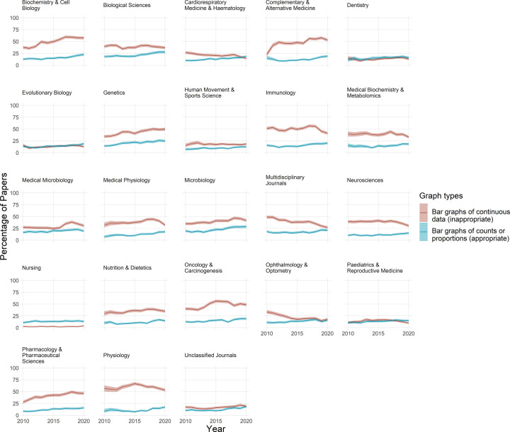
Figure 2. Bar graphs are commonly used incorrectly.
Each graph shows the percentage of papers that use bar graphs to display continuous data (red line), vs. counts and proportions (blue line), for one of 23 fields over an 11-year period. Shaded regions above and below each bar display 95% confidence intervals. The percentage of papers that use bar graphs for continuous data ranges between approximately 5% and 60% of papers, depending on the field. With the exception of a few fields where bar graphs are uncommon (e.g. nursing, dentistry), the improper use of bar graphs to display continuous data is more common than the correct use of bar graphs to display counts and proportions.

