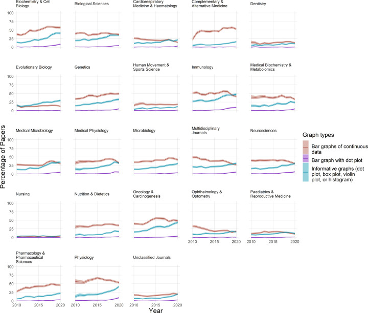
Figure 4. The use of bar graphs, bar graphs with dot plots, and more informative graphs to display continuous data.
Each graph displays data for one of the 23 fields over an 11-year period. Lines show the percentage of papers that use bar graphs (red line), bar graphs with overlaid dot plots (purple line), or a more informative graph type (blue line) to display continuous data. Shaded regions show 95% confidence intervals. The informative graphs category includes dot plots, box plots, violin plots, and histograms. Bar graphs are the least informative graph type. Bar graphs with dot plots are suboptimal.

