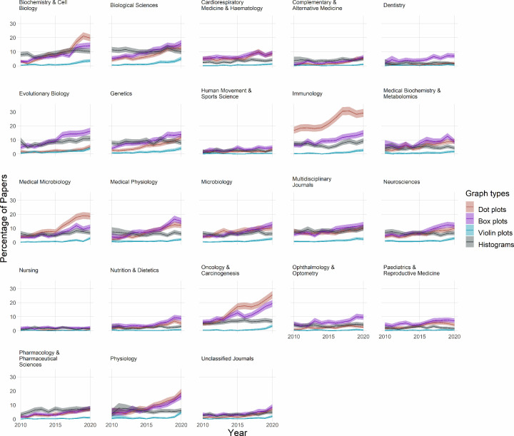
Figure 5. The use of dot plots, box plots, violin plots and histograms.
Small multiples show data for 23 fields over an 11-year period. Lines show the percentage of papers that use dot plots (red line), box plots (purple line), violin plots (blue line), or histograms (gray line). Note that the y-axis shows values up to 30% to allow readers to see percentages for these less common graph types.

