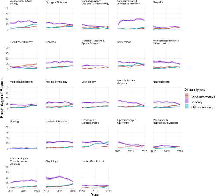
Figure 7. Are authors who use bar graphs of continuous data also using more informative graphs?
Small multiples display the proportion of papers that include both bar graphs of continuous data and more informative graphs (dot plots, box plots, violin plots, or histograms) (red line), only bar graphs of continuous data (purple line), or only more informative graphs (blue line) between 2010 and 2020. Shading represents the 95% confidence interval.

