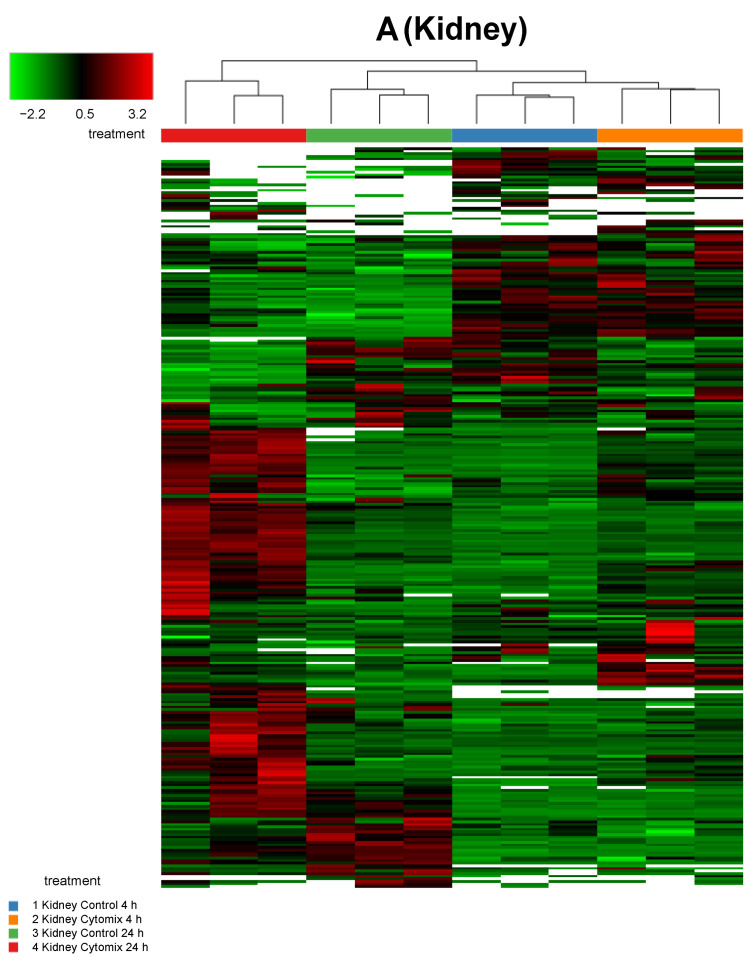
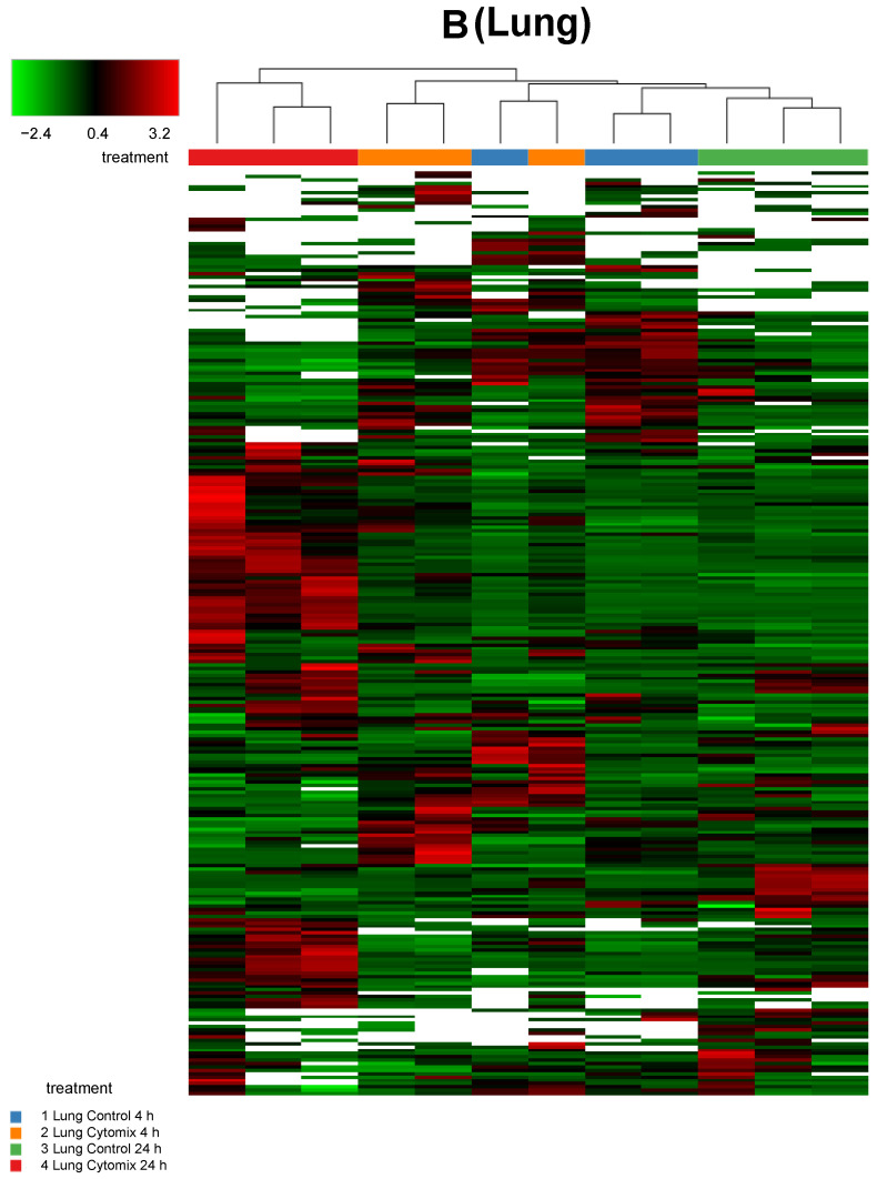
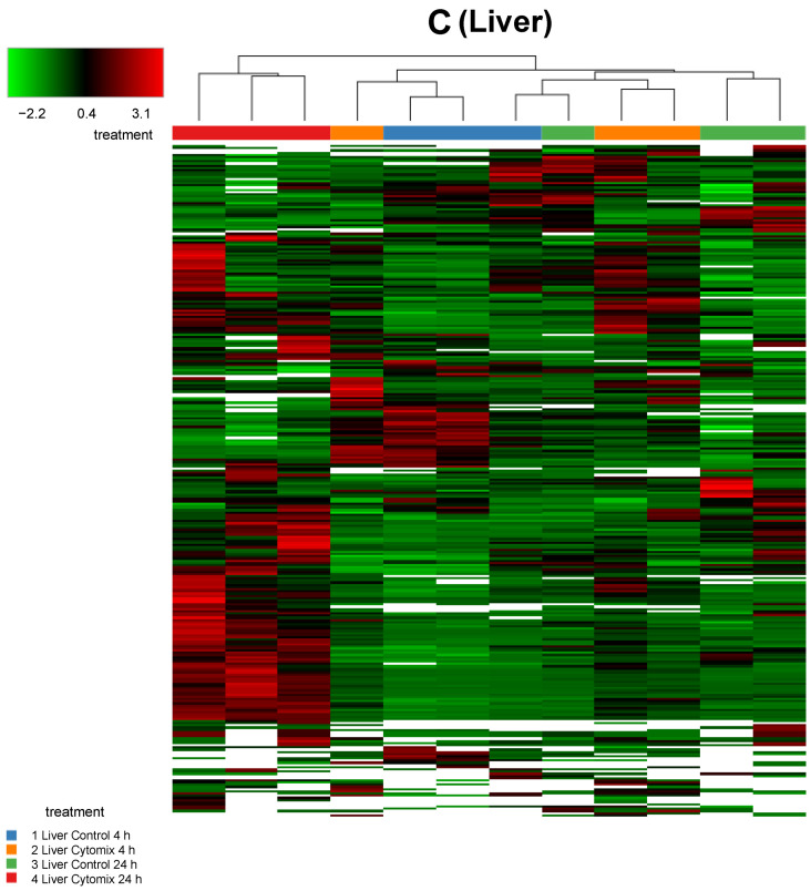
Figure 2.
Sample clustering of heatmaps highlighting the overall similarity and differences in normalized protein expression (p < 0.05) across control and cytomix conditions for all replicates in the kidney (panel A), lung (panel B) and liver (panel C) at 4 h and 24 h. The white bars in the heatmaps represent those proteins that did not show any expression. The color bars on top of the heatmap represent different treatment groups. Blue bars indicate control at 4 h, orange cytomix at 4 h, green control at 24 h and red cytomix at 24 h. The color key in the top left shows whether protein expression was above or below the mean.


