Figure 5.
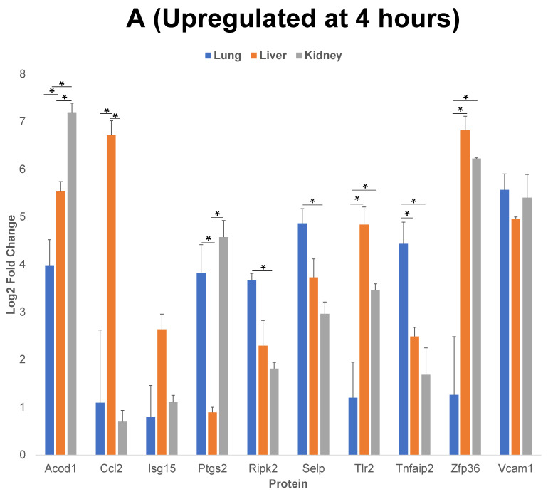
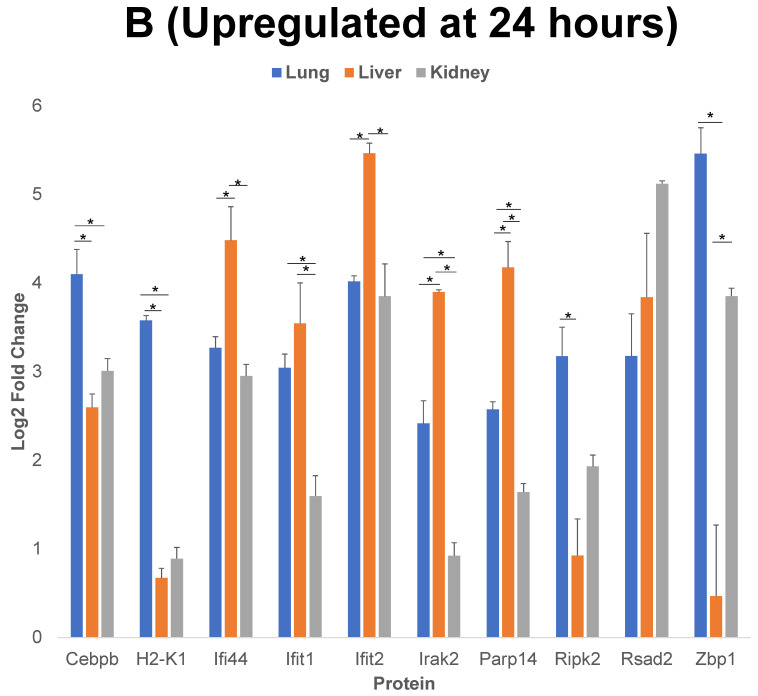
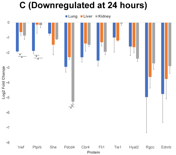
Comparison of 10 of the proteins that have the highest level of upregulation or downregulation compared to control post cytomix treatment at 4 h and 24 h. Panels A and B represent the 4 h and 24 h upregulated proteins, respectively, and panel C represents the downregulated proteins at 24 h. These bar plots highlight the differential expression of proteins across organs. The y-axis represents the log2 level change compared to the background levels of each protein. The blue, orange and gray bars represent lung, liver and kidney ECs, respectively. Data are plotted as mean ± SEM (n = 3). Analysis of Variance (ANOVA) with Tukey post-hoc test was used to identify statistically significant differences. The “*” symbol indicates that there was a significant difference (p < 0.05) between organs.


