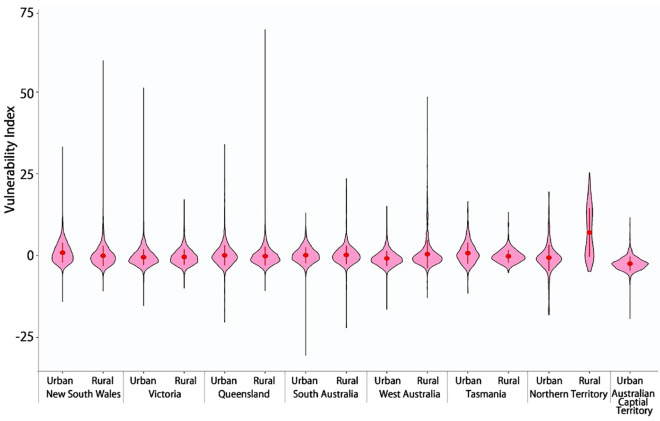
Figure 5.
Violin plots showing the statistical distribution of the vulnerability index in urban and rural areas. Statistical details are provided in Supplementary Table S8. The vertical black line indicates the range (maximum and minimum) of the vulnerability index. The width of water-drop pink areas indicates the density distribution of the vulnerability index; a wider width means more spatial units (SA1s) concentrate in that vulnerability index. The red dot indicates the mean of the vulnerability index and the vertical red line represents 95% confidence intervals. X axis presents the ACT as urban space together with seven states which were divided into urban and rural space. The ranges of the vulnerability index across are substantially different urban and rural space. In Victoria and Tasmania, the vulnerability index in urban areas (e.g., Melbourne: − 15.260 to 51.240) have wider ranges than that in its rural areas; while in other states (e.g., New South Wales, Queensland, and West Australia), the vulnerability index in urban areas (e.g., Sydney: − 14.038 to 33.238), have wider ranges than the vulnerability index in rural areas (Supplementary Table S8).

