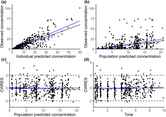
FIGURE 2.

Goodness‐of‐fit plots of the final parametric model: observed versus individual predictions (a), observed versus population prediction (b), conditional weighted residuals (CWRES) versus population predicted concentrations (c), or time after dose (d). Black lines indicate the line of unity a and b or zero c and d, and blue lines indicate linear trends.
