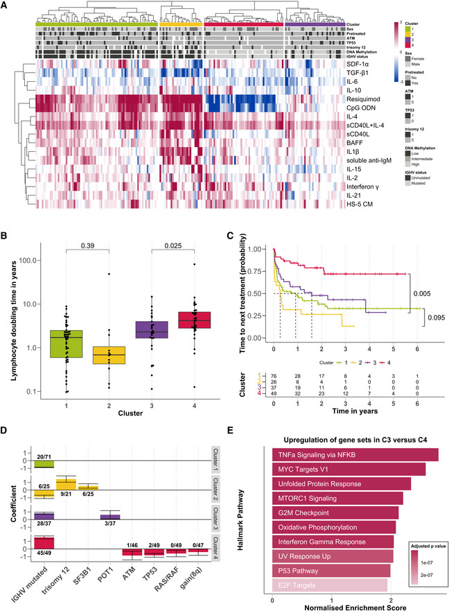
Heatmap showing viability measurements for the 192 samples (rows) subject to each of 17 microenvironmental stimuli (columns). The data are shown on a robust z‐score scale, that is, the logarithm of the relative viability measurements was scaled by the median absolute deviation within each row. Limits were applied to scaling factor for optimal visualisation. Red indicates increased viability, and blue indicates decreased viability. Samples are annotated for genetic features, sex and pre‐treatment status.
Lymphocyte doubling time, a clinical marker for disease progression, plotted for each cluster, within the subset of 115 for which this measurement was available (C1: n = 46; C2: n = 12; C3: n = 25; C4: n = 32). P‐values from Student's t‐test (non‐paired, two‐sided). The central bar, boxes and whiskers of the plot represent the median, first and third quartiles, and 1.5‐time interquartile range (IQR), respectively.
Clinical outcome. Kaplan–Meier curves of time to next treatment for each cluster. P‐values from univariate Cox proportional hazard models comparing C1 with C2, and C3 with C4. Survival data were available for 188 patient samples.
Genetics. Multinomial regression quantifies association of genetic features with each cluster. X‐axis indicates genetic features, and y‐axis indicates coefficient from multinomial regression, indicating enrichment or depletion of the feature within each cluster. Text labels show the number of positive cases and the total number of cases tested for the feature, in each cluster. Error bars represent mean ± standard deviation.
Transcriptomes. GSEA comparing the expression of genes in samples from C3 (
n = 9) versus those C4 (
n = 12). Normalised enrichment scores are shown for the top 10 most significant Hallmark gene sets (Liberzon
et al,
2015).

