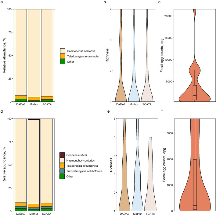
Fig. 2.
Comparisons of the mean species relative frequencies and species richness between the three pipelines both pre- and post-treatment, supplemented with egg count data. Mean fractions of each major (> 1%) species were compared between the pipelines for both pre- (a) and post-treatment (d) samples. Colors represent different species, or a collection of rare species, as indicated in the legend. Species richness was also compared between the pipelines for both pre- (b) and post-treatment (e) samples. Egg counts for samples pre-treatment (c) and post-treatment (f) are also shown. Box plots within the violin plots for egg counts represent the median values

