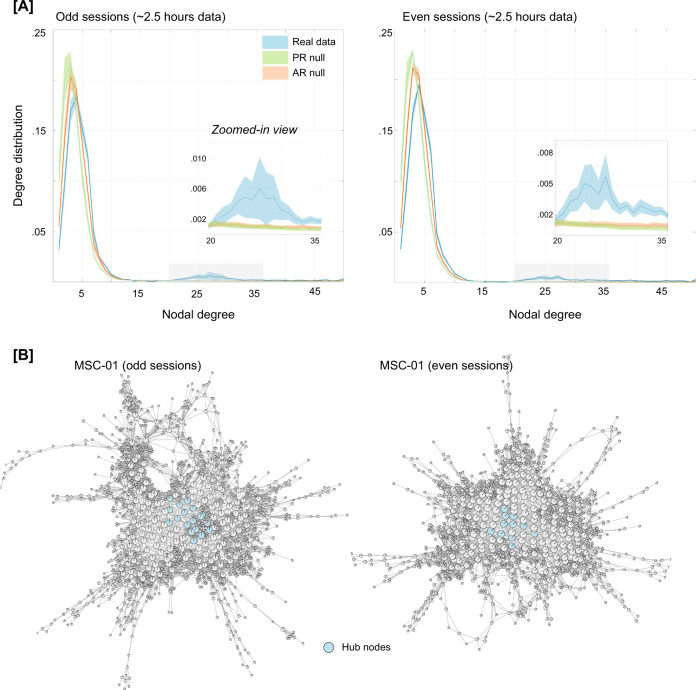
Fig. 2. Characterizing the Mapper-generated graph using degree distribution.
A Degree distributions averaged across the ten participants, separately for odd and even sessions. For examining linear vs. nonlinear aspects, two null models were used, namely, the phase randomized null and the multivariate autoregressive null model. As evident from the degree distribution plots, real data show a significantly fat tail (>20) as compared to both nulls. This finding was independently replicated in both halves of the data. The shaded area represents standard error around the mean (SEM). B Show Mapper-generated graphs for a representative participant (MSC-01), highlighting nodes that act as hubs (i.e., nodes with high degree (>20) and high centrality (top 1%)). Similar plots were observed across all MSC dataset participants (see Fig. S2).

