. 2022 Apr 3;21(6):1020–1029. doi: 10.1158/1535-7163.MCT-21-0442

Figure 6.

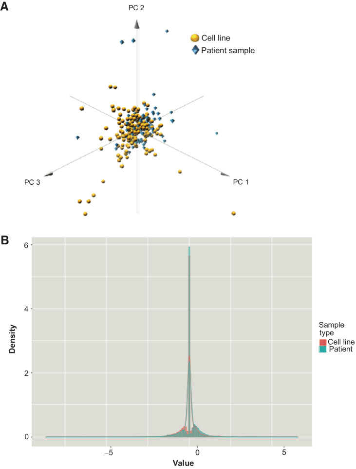
Figure 6. Comparison phosphoprotein changes in patient samples and cell lines. A, 3D plot showing that for the first three principal components of the phosphoproteomic data, patient samples (blue diamonds) show comparable distribution with cell line data (yellow circles), indicating that changes in phosphorylation in cell line panels could potentially reflect changes within clinical samples. B, Probability density functions of cell line and patient data, showing a strong overlap in distribution and peak values between the two sample types, despite a Welch Two Sample t test, indicating that the two groups have different means (P = 0.006804). Here, x-axis plots the value of dynamic phosphoprotein changes, and the y-axis (density) is proportional to frequency.

Comparison phosphoprotein changes in patient samples and cell lines. A, 3D plot showing that for the first three principal components of the phosphoproteomic data, patient samples (blue diamonds) show comparable distribution with cell line data (yellow circles), indicating that changes in phosphorylation in cell line panels could potentially reflect changes within clinical samples. B, Probability density functions of cell line and patient data, showing a strong overlap in distribution and peak values between the two sample types, despite a Welch Two Sample t test, indicating that the two groups have different means (P = 0.006804). Here, x-axis plots the value of dynamic phosphoprotein changes, and the y-axis (density) is proportional to frequency.