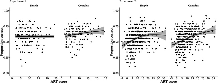
Fig. 2.
Performance in experiment 1 and experiment 2. Lines depict smoothed trend line estimated from raw data using a generalized additive model; bands are standard error. Dots indicate average performance in condition for each participant, jittered for visualization. Note, the x-axis scale for experiment 2 represents a larger range of ART scores than experiment 1

