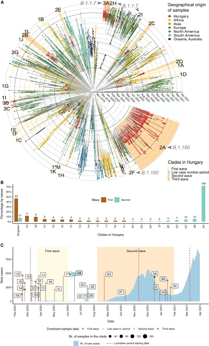
Figure 3.

Transmission dynamics in the first and second waves. (A) Time-scaled phylogeny of SARS-CoV-2 genomes sampled in Hungary and globally. Tips and tip branches are coloured based on the geographical origin of the samples—Hungarian samples are shown in red. Concentric circles indicate the first day of each month. The start and end dates of the two waves are indicated with bolder circles. Hungarian clades are highlighted according to the time period when most of the samples were taken. The names of the clades start with 1, 2, or 3 for the clades in the first, second, and third waves, respectively, and are ranked using the alphabet based on their sizes (no. of samples in the clade). Sample ‘1*M’ represents the only clade from the low case number period. (B) Relative sizes of the Hungarian transmission lineages are shown as a percentage of genomes belonging to each transmission lineage (with absolute numbers shown above each bar). Coloured bars represent the first and second waves, respectively. The clades shown on the x-axis are ordered by decreasing percentages in the first wave and increasing percentages in the second wave. Percentages of singletons are shown on the left. (C) Timeline showing the number of new COVID-19 cases in Hungary (light blue area) and the TMRCA of each Hungarian clade. The size of TMRCA dots shows the number of Hungarian genome samples in each clade. Dots are coloured according to the time period (first wave, low case number period, and second and third waves) dominant in the clade (see Supplementary Table ST6). Periods of the first and second waves are highlighted with a light and dark yellow background. The start date of lockdown periods is indicated with vertical dark red-dashed lines.
