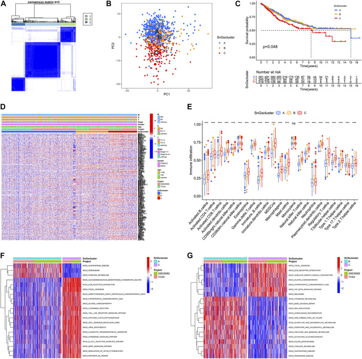
FIGURE 1.
Three clusters based on cellular senescence-related gene expression levels. (A) Consensus Cluster Analysis. When cluster Num = 3, the relationship in the cluster was tight and the correlation between clusters was weak. (B) PCA plot. Blue dots represent patients in Cluster A; yellow dots represent patients in Cluster B; red dots represent patients in Cluster C. (C) Kaplan-Meier survival curves. The prognosis of patients was different among the three clusters, p = 0.048. (D) Heat map. Cellular senescence-related genes were upregulated in Cluster C. (E) Box plots. The horizontal coordinate represents immune infiltrating cells; the vertical coordinate represents immune scores; ns represents no difference in immune cell scores among the three clusters; ∗ ∗ ∗ p < 0.001. (F) Differential GSVA enrichment pathways between Cluster A and Cluster C. Red represents the high expression pathway and blue represents the low expression pathway. (G) Differential GSVA enrichment pathways between Cluster B and Cluster C. Red represents the high expression pathway and blue represents the low expression pathway.

