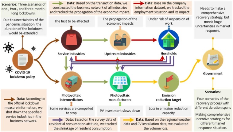
Fig. 1.
Mechanism of the COVID-19 market slowdown modeling. The arrows represent the propagation and causal chains of the economic impact. The colors of the arrows vary according to different data sources and methods. The orange panes illustrate the data sources and how the data were utilized in this research. The grey panes show the specific impacts on each component of the distributed PV market under the COVID-19 lockdown policy. The green panes represent the scenarios we set to give a comprehensive analysis of different situations. In this model, the input datasets are official lockdown measure information, financial transaction data, company information data, survey data of residential consumption attitude, regional weather data, and PV installation data. (For interpretation of the references to color in this figure legend, the reader is referred to the web version of this article.)

