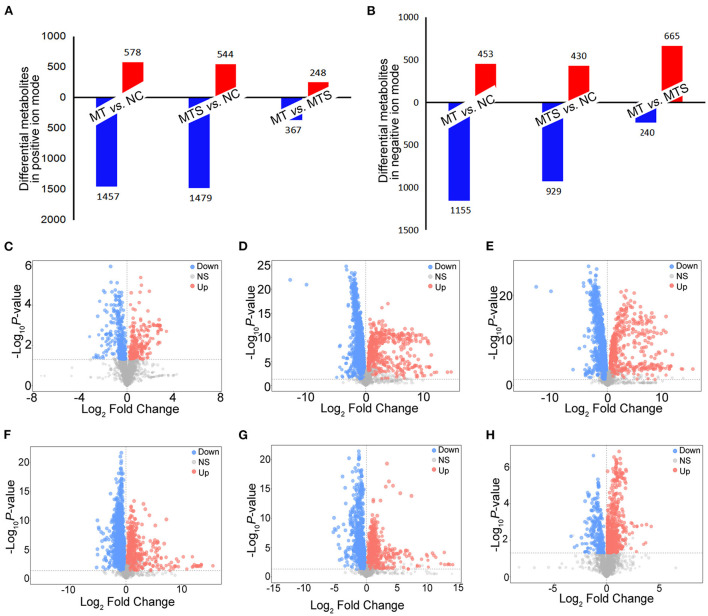
Figure 3.
The distribution of differential plasma metabolites among NC, MT and MTS. (A) The number of differential plasma metabolites among NC, MT and MTS in the ESI+ model. (B) The number of differential plasma metabolites among NC, MT and MTS in the ESI- model. (C) Volcano plot of the MTS vs. MT groups in ESI+ model. (D) Volcano plot of the MT vs. NC groups in ESI+ model. (E) Volcano plot of the MTS vs. NC groups in the ESI+ model. (F) Volcano plot of the MTS vs. MT groups in ESI- model. (G) Volcano plot of the MT vs. NC groups in the ESI- model. (H) Volcano plot of the MTS vs. NC groups in the ESI- model. Each point in the volcano plot represents a significantly different metabolite, red represents upregulated metabolites, blue represents downregulated metabolites, and gray dots indicate non significant differences. (C–H) were drawn by R version 4.0.2.

