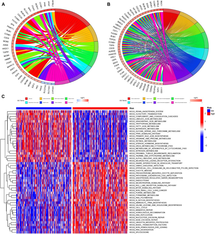
FIGURE 10.
Enrichment analysis of DEGs among patients with different risk scores (A,B) GO and KEGG enrichment analysis was performed on genes differentially expressed among patients in different risk groups. The left half of the circle diagram was the gene item, and the right was the annotated function item; (C) GSVA analysis could analyze the pathways between patients with different risks, and the results were shown in the heatmap. Blue meant the pathway down, red meant the pathway up. The blue horizontal axis above the figure represented the low-risk group, and the red horizontal axis represented the high-risk group.

