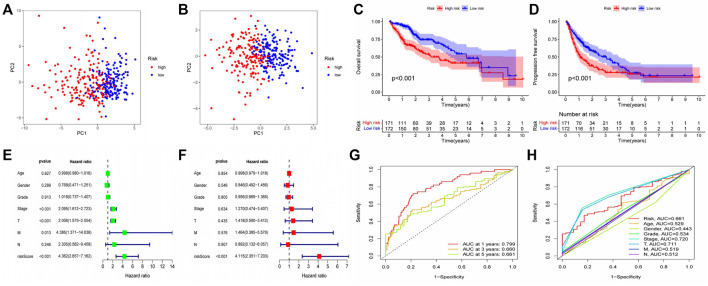
FIGURE 5.
Validation of Prognostic Model Reliability by Several Methods (A–B) PCA analysis showed that patients with different risk scores could be well distinguished in the model. Blue points represented low risk group, and red points represented high risk score group; (A) training set (TCGA cohort). (B) validation set (GEO cohort) (C–D) Survival analysis based on Kaplan-Meier method was performed on the total survival time and progression-free survival time of patients with different risk scores. The horizontal axis under the image refers to the number of surviving patients in different years; (C) training set (TCGA cohort). (D) validation set (GEO cohort) (E–F) The prognostic model and common clinical features were analyzed by univariate or multivariate COX regression. HR value represents that the probability of death in the high-risk group per unit time was a multiple of that in the low-risk group. (G) The area under the ROC curve was used to evaluate the accuracy of the prognostic model. Red, yellow and green lines represent the 1 - year, 2 - year and 3 - year survival of patients, respectively. AUC >0.5 indicates that the prognostic model is meaningful, and the closer to one indicates that the accuracy of the prognostic model is higher. (H) This ROC curve compared the ability of clinical characteristics and risk score to predict the prognosis of patients. The area under the red curve represented the prediction ability of risk score.

