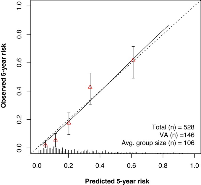
Figure 2.
Calibration plot showing the agreement between predicted (x axis) and observed (y axis) 5-year risk of the primary outcome. Triangles represent binned Kaplan–Meier estimates with 95% confidence intervals for quintiles of predicted risk. Straight line is the continuous calibration hazard regression. Dotted line represents perfect calibration. Spike histogram on the x axis reflects the number of patients with a predicted risk corresponding to the x axis value. VA, ventricular arrhythmia.

