. 2022 Mar 8;12(3):670–691. doi: 10.1158/2159-8290.CD-21-0683

Figure 2.

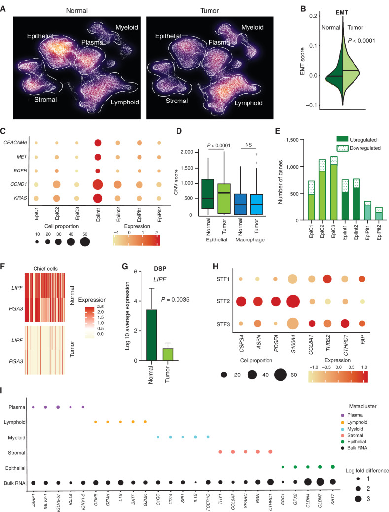
Figure 2. scRNA-seq deconvolutes gastric tumor programs associated with distinct cell states. A, Density plot of UMAP representation comparing normal and gastric tumor samples after random downsampling to approximately 30,000 cells each to allow statistical equivalence. Each dot represents a single cell. Dashed lines highlight higher proportions of epithelial cells in normal samples and myeloid cells in tumor samples. B, Split violin plot of EMT oncogenic gene signature score in normal and tumor cells, showing a significantly higher score in tumor cells. C, Bubble plot depicting the expression of gastric cancer oncogenes in tumor epithelial cell clusters. The size of the circle represents the percentage of cells expressing the gene in that specific epithelial cell cluster, whereas the color represents the average expression of the gene. D, Box plot depicting CNV scores for epithelial cells (green) and macrophage cells (blue) in normal and tumor samples. CNV scores were computed using InferCNV. P values were computed using Wilcoxon rank-sum test. E, Bar graph depicting differences in transcriptomic profiles between tumor and normal tissue by number of upregulated and downregulated genes in epithelial cell clusters. F, Heat map of LIPF and PGA3 gene expression (classic chief cell marker genes) in tumor versus normal samples. Darker color signifies higher expression. G, Gene expression of LIPF by DSP analysis, in tumor epithelial cells (Pan-CK+) compared with normal samples (n = 13). H, Bubble plot depicting sublineage-specific expression of CAF marker genes FAP, CSPG4, PDGFA, ASPN, S100A4, COL8A1, THBS2, and CTHRC1 in fibroblast clusters. STF1 and STF3 are LUM-associated fibroblasts, whereas STF2 comprises proangiogenic pericytes. The size of the circle represents the percentage of cells expressing the gene in that specific fibroblast cell cluster, whereas the color represents the average expression of the gene. I, Bubble plot depicting significant log fold differences in expression of genes between tumor and normal by metacluster mapped against the bulk RNA-seq data (five genes per metacluster are shown). The size of the circle represents the log fold change in the expression of specific genes.

scRNA-seq deconvolutes gastric tumor programs associated with distinct cell states. A, Density plot of UMAP representation comparing normal and gastric tumor samples after random downsampling to approximately 30,000 cells each to allow statistical equivalence. Each dot represents a single cell. Dashed lines highlight higher proportions of epithelial cells in normal samples and myeloid cells in tumor samples. B, Split violin plot of EMT oncogenic gene signature score in normal and tumor cells, showing a significantly higher score in tumor cells. C, Bubble plot depicting the expression of gastric cancer oncogenes in tumor epithelial cell clusters. The size of the circle represents the percentage of cells expressing the gene in that specific epithelial cell cluster, whereas the color represents the average expression of the gene. D, Box plot depicting CNV scores for epithelial cells (green) and macrophage cells (blue) in normal and tumor samples. CNV scores were computed using InferCNV. P values were computed using Wilcoxon rank-sum test. E, Bar graph depicting differences in transcriptomic profiles between tumor and normal tissue by number of upregulated and downregulated genes in epithelial cell clusters. F, Heat map of LIPF and PGA3 gene expression (classic chief cell marker genes) in tumor versus normal samples. Darker color signifies higher expression. G, Gene expression of LIPF by DSP analysis, in tumor epithelial cells (Pan-CK+) compared with normal samples (n = 13). H, Bubble plot depicting sublineage-specific expression of CAF marker genes FAP, CSPG4, PDGFA, ASPN, S100A4, COL8A1, THBS2, and CTHRC1 in fibroblast clusters. STF1 and STF3 are LUM-associated fibroblasts, whereas STF2 comprises proangiogenic pericytes. The size of the circle represents the percentage of cells expressing the gene in that specific fibroblast cell cluster, whereas the color represents the average expression of the gene. I, Bubble plot depicting significant log fold differences in expression of genes between tumor and normal by metacluster mapped against the bulk RNA-seq data (five genes per metacluster are shown). The size of the circle represents the log fold change in the expression of specific genes.