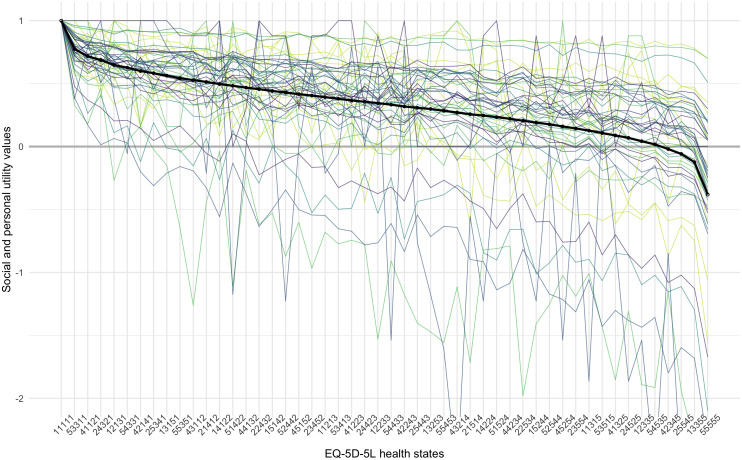
Figure 3. Personal and group-level utility functions for 50 health states, ordered from best to worst, according to the group preference.
The thick lines represent the group preference, and the thin lines represent the 50 underlying personal utility functions. The different colours are used to distinguish between separate individuals and have no other meaning.

