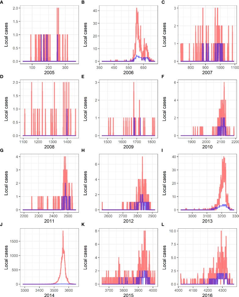
Figure 6.
Verification of predictive results and actual incidence of local dengue fever from 2005 to 2016 in China. Red curves present the actual cases, and blue curves are the predicted curves created by Generalized Additive Models. (A) 2005. (B) 2006. (C) 2007. (D) 2008. (E) 2009. (F) 2010. (G) 2011. (H) 2012. (I) 2013. (J) 2014. (K) 2015. (L) 2016.

