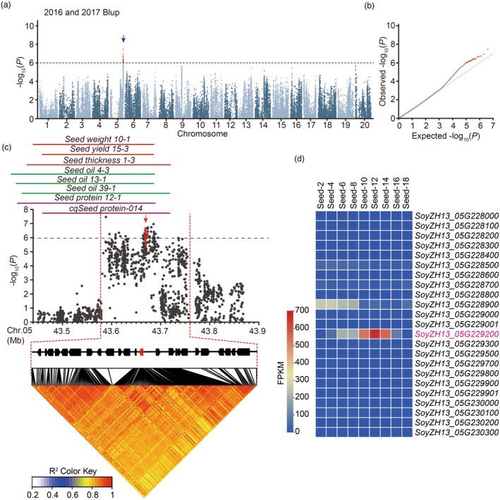
Figure 1.

GWAS of seed thickness in the soybean germplasm. (a) Manhattan plot of GWAS results for seed thickness from 2016 and 2017 best linear unbiased prediction (BLUP) data. (b) Quantile–quantile plot of the GWAS results under a mixed linear model (MLM). (c) Local Manhattan plot (top) and linkage disequilibrium plot (bottom) for SNPs surrounding the peak on chromosome 5. The red dashed lines indicate the candidate region for the peak. The red plot indicates the nucleotide variation of GmST05. The solid lines above the plot represent the genomic locations of quantitative trait loci (QTLs) retrieved from SoyBase (https://soybase.org/). The red, green and orange lines are QTLs for seed size (yield), seed oil content and protein content, respectively. (d) A heat map for candidate genes located in the candidate region. The colour key (blue to red) represents gene expression (fragments per kilobase per million mapped reads, FPKM).
