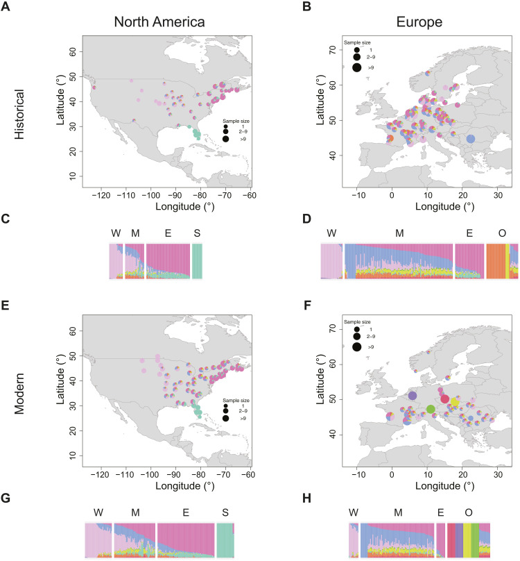
Fig. 2. Admixture proportions for A. artemisiifolia populations.
The NGSadmix run of a joint analysis including all samples with the highest likelihood for K = 9 was used for plotting. The same color scheme was used across all panels. (A, B, E, and F) Admixture maps. Samples within 100 km were grouped together, and the average ancestry across those groups was plotted. If samples were grouped together, then ancestry values were plotted at the centroid of the group. (C, D, G, and H) Admixture barplots. Each bar represents one individual. Samples are grouped on the basis of their geography: W, West; M, Mideast; E, East; S, South; O, other. (A) Historical North America. (B) Historical Europe. (C) Historical North America. (D) Historical Europe. (E) Modern North America. (F) Modern Europe. (G) Modern North America. (H) Modern Europe.

