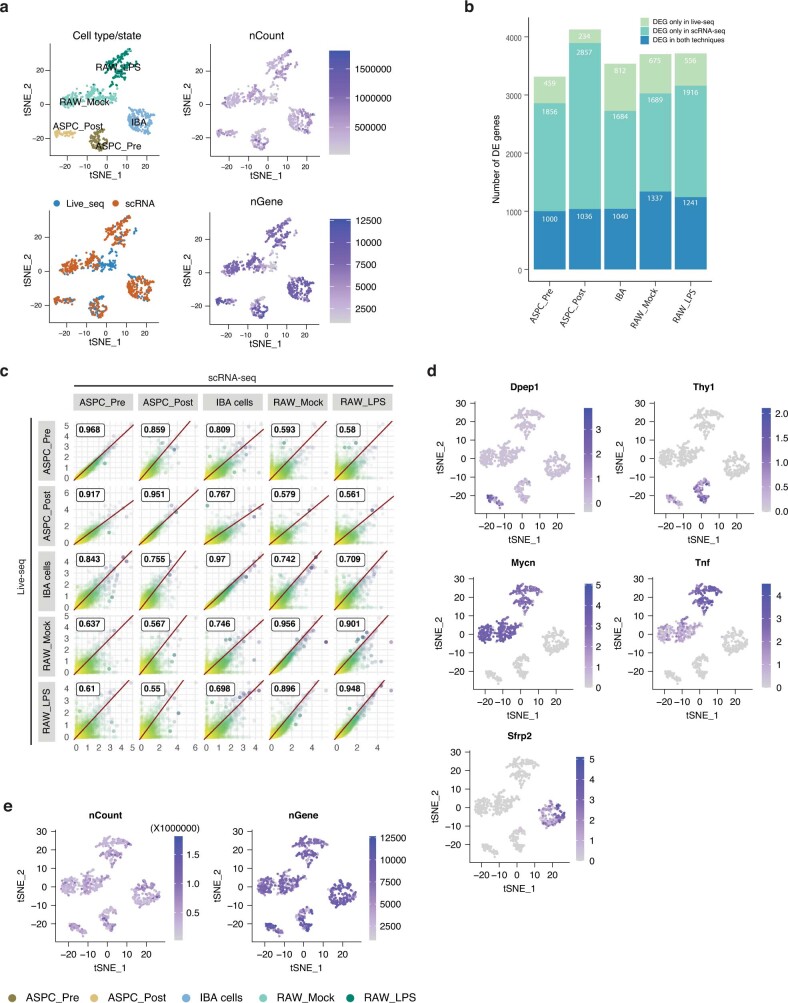
Extended Data Fig. 5. Comparison of Live-seq and scRNA-seq data, relative to Fig.2.
(a) tSNE-based visualization of integrated scRNA-seq and Live-seq data according to cell type or treatment, approach, number of detected genes (nGenes), and total counts of all genes (nCount) without batch correction. (b) Barplot displaying the number of overlapping genes identified as differentially expressed in the Live-seq and scRNA-seq data for each cell type and state versus the rest. (c) The correlation between simulated bulk data (i.e. based on the aggregation of each scRNA-seq or Live-seq expression profile into bulk-like data) across cell type and state (treatment), which shows that the Live-seq and scRNA-seq data are highly correlated. The Pearson correlation value is shown inside each of the subpanels. (d) tSNE-based visualization of marker gene expression on integrated scRNA-seq and Live-seq data. (e) Additional quality controls relative to Fig. 2f: visualization of Live-seq and scRNA-seq data after anchor-based data integration (Methods) according to the number of detected genes and total gene expression count.

