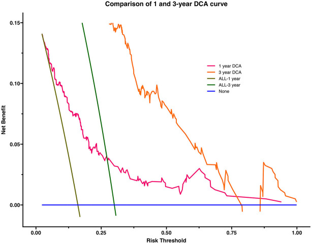
Figure 3.
Comparison of 1 and 3-year DCA: The abscissa of the graph is threshold probability (threshold probability). All line and none line are representative of one extreme state. The all line represents all patients with a bad outcome and the none line represents all patients without a bad outcome. It can be seen from the figure that both the 1-year DCA curve and the 3-year DCA curve are above the extreme line, thus illustrating that the newly constructed prediction model is of clinical utility. The area under the curve was 0.030 for the 1-year DCA curve and 0.085 for the 3-year DCA curve, so there would be some improvement in a patient's risk of death within 3 years if interventions were required to be implemented using this model.

