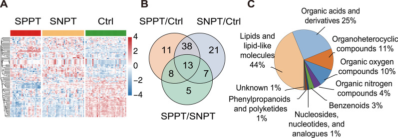
Fig. 1.
Plasma metabolomic analysis for the SPPT patients, SNPT patients and controls. A Heatmap showing 103 differential abundant metabolites (DAMs, VIP > 1, p < 0.05) among the three groups. The colored bar above the heatmap represent the SPPT (red), SNPT (orange) and Ctrl (green) samples. The color key indicates the scaled expression levels of the 103 metabolites for the three groups. B Venn diagram showing the differential metabolites among the three groups. C Pie chart showing the chemical classification of the 103 significantly differentially abundant metabolites according to the HMDB database

