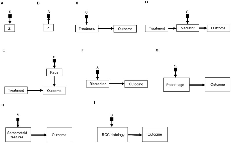
Figure 3.
Examples of causal relationships represented by selection diagrams to guide transportability of causal effects across populations: (A) Selection node S indicating shifts across populations in the variable Z. In this scenario, the possible values of Z inherently differ between populations; (B) Selection node S indicating selection bias for the variable Z. In this scenario, the differences in Z between populations are due to sampling biases and not due to inherent variation; (C) Selection node S indicating treatment shifts across populations; (D) Selection node S indicating mediator shifts across populations; (E) Selection node S indicating shifts in the race of patients treated in a randomized controlled trial (RCT) performed in the United States, compared with an RCT performed in China. In this diagram, the variable “race” directly influences the outcome of interest and the race of patients enrolled is different between the two RCTs; (F) Selection node S indicating shifts in biomarker values across populations; (G) Selection node S indicating shifts in patient age across populations; (H) Selection node S indicating shifts in the presence or absence of sarcomatoid features across populations; (I) Selection node S indicating shifts in RCC histology across populations.

