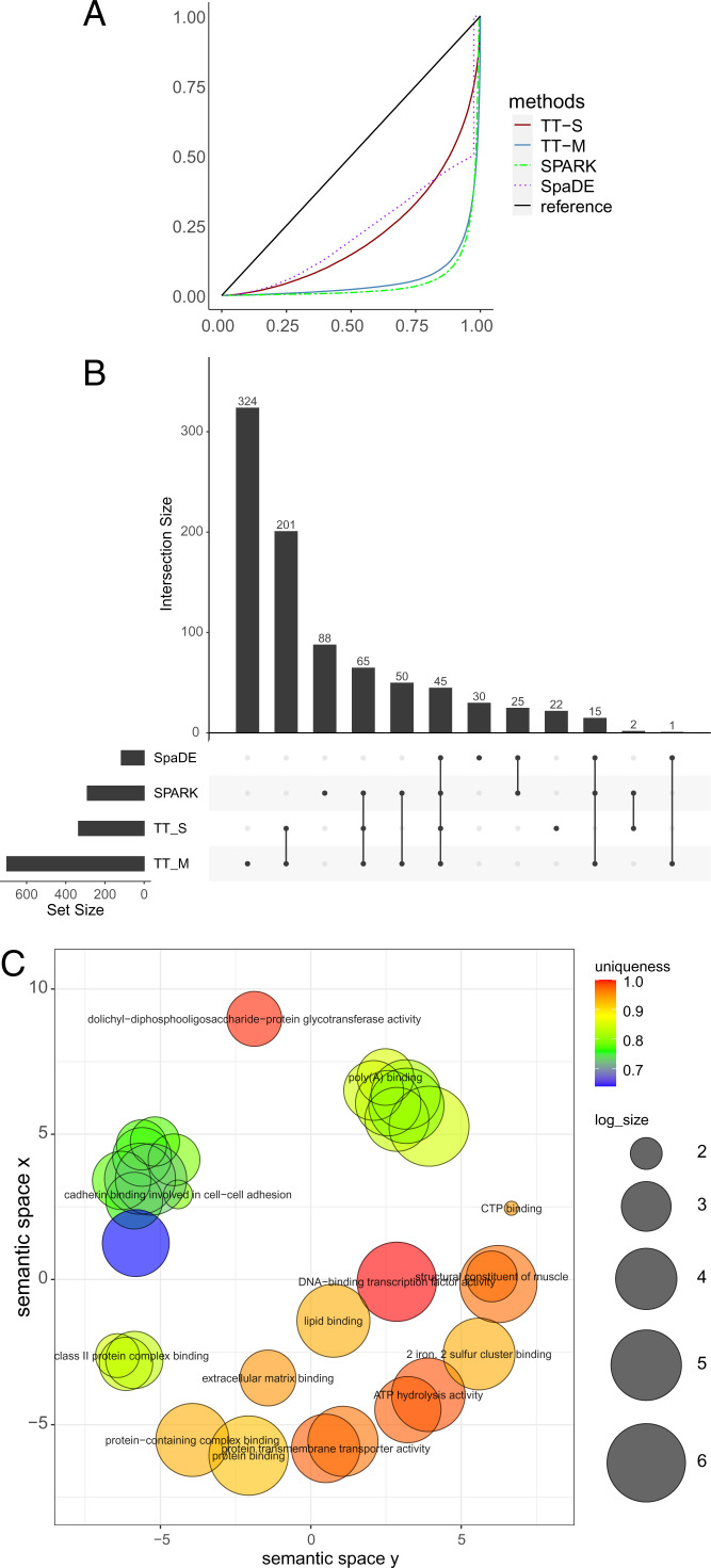
Fig. 9.
Analysis for the human breast cancer data. (A) The empirical distribution of the P values under the null condition in the permuted data. The blue solid line and red solid line denote the multiple splits (TT-M) and single splits (TT-S). The green dashed line denote SPARK, and the purple dotted line denotes SpaDE. (B) The upset plot shows the overlap of genes for all the four methods. (C) The clustering of GO annotations for the genes detected by TT-M.

