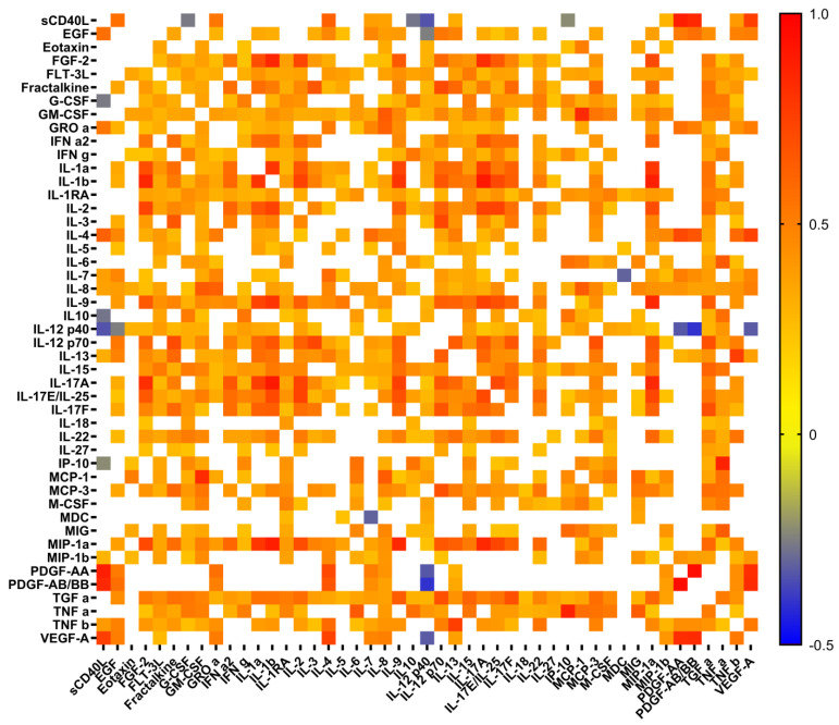
Figure 1.
Heat map of correlation between cytokine levels in plasma samples from patients with COVID-19. Only significant correlations are presented. Color scale bars show a range of correlation coefficients (r). The red color represents a high positive correlation, decreasing to the blue color bar, which represents a negative correlation.

