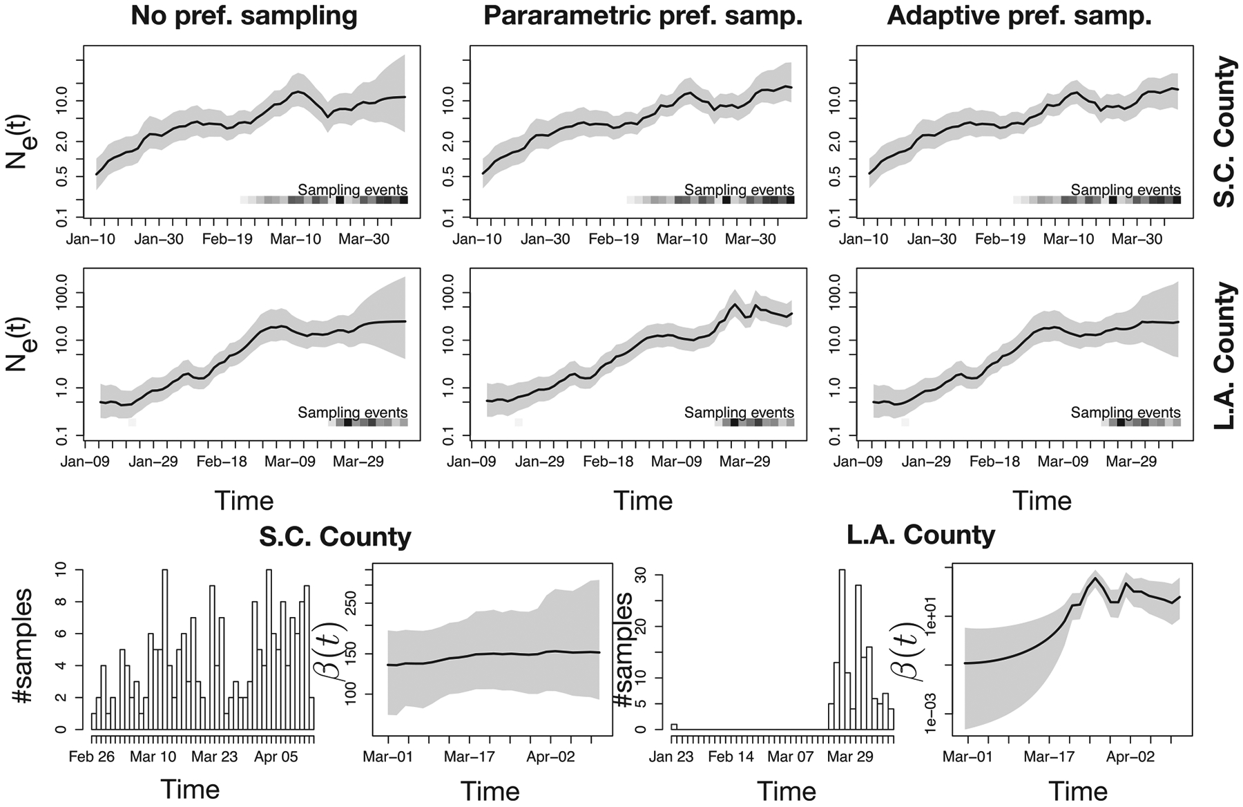
Figure 5.

Phylodynamic inference with noPref, parPref and adaPref models from SARS-CoV-2 genealogies inferred from GISAID data obtained from Los Angeles and Santa Clara counties. First two rows panels depict Ne(t) posterior distributions inferred using three possible priors: the noPref (Palacios and Minin 2012), the parPref Karcher et al. (2016), and our adaPref prior. The last row first and third panels depict how many samples are collected each day. The second and fourth panels depict β(t) posterior distribution (only under the adaPref prior). The posterior medians are depicted as solid black lines and the 95% Bayesian credible regions are depicted by shaded areas. Sampling times are also depicted by the heat maps at the bottom of the top two rows panels: the squares along the time axis depicts the sampling time, while the intensity of the black color depicts the number of samples.
