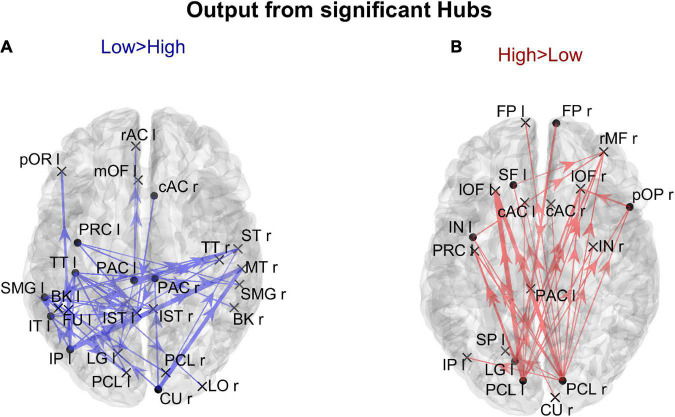
FIGURE 9.
Representation of the connection differences exiting from the ROIs which exhibited significant differences of hubness between the two groups. The left panel in blue [Low > High (A)] displays the connection differences exiting from the “Low > High” hubness ROIs (the ROIs shown in the left lower panel in Figure 8), for connections higher in the Low compared to the High AQ score Group. The right panel in red [High > Low (B)] displays the connection differences exiting from the “High > Low” hubness ROIs (the ROIs shown in the right lower panel in Figure 8), for connections higher in the High compared to the Low AQ score Group. The plotted connections run from the ROIs with significant hubness (marked with a dot) toward generic input ROIs (marked with a cross). The thickness of each link varies according to the value of the connection difference. Three levels of thickness are adopted, with a higher thickness indicating a larger connectivity difference.

