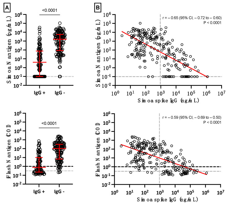
Figure 4.
(A) Positive and negative SARS-CoV-2 Spike IgG results in serum according to antigenemia. The grey dotted lines on the Y-axis correspond to the positivity cut-off of each antigen assay, as found by ROC curve analyses. The black dotted line on the Y-axis of the iFlash panel represents the cut-off specified by the manufacturer. (B) Linear regression of antigenemia obtained with the two antigen assays versus the amount of SARS-CoV-2 Spike IgG. The grey dotted line on the X-axis represents the positivity cut-off for IgG directed against the spike protein.

