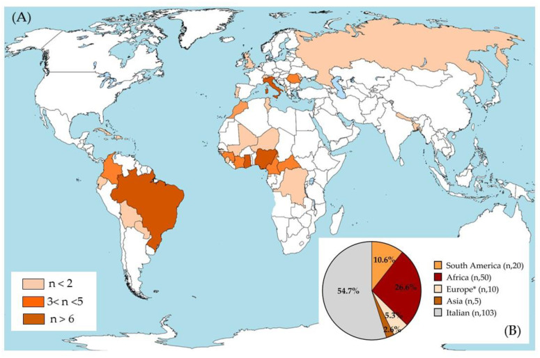
Figure 1.
Geographical distribution of the population studied. (A) The three colors represent the total number of isolates for each country, as defined in the legend (n = sample size). (B) The pie chart represents the sample size for each continent and the relative percentage of the population compared to all subjects included in the study. * Europe without Italy. This image was modified starting from the file BlankMap-World-v6.png from the Wikimedia Commons free media repository; GNU Free Documentation License.

