Figure 3.
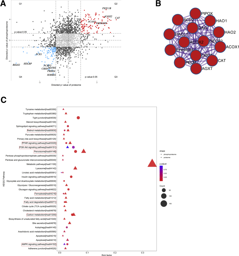
Proteome–phosphoproteome correlation.A, Proteome–phosphoproteome comparison. Q1, Q2, Q3, and Q4 mark the quadrants of the correlation plots. B, Protein–protein interaction analysis of the proteins that differed significantly in protein abundance and phosphorylation status. C, KEGG metabolic pathway enrichment analysis in the proteome and phosphoproteome. The lipid metabolism-associated pathways are circled in red. (PNAHS, n = 10; control, n = 8).

