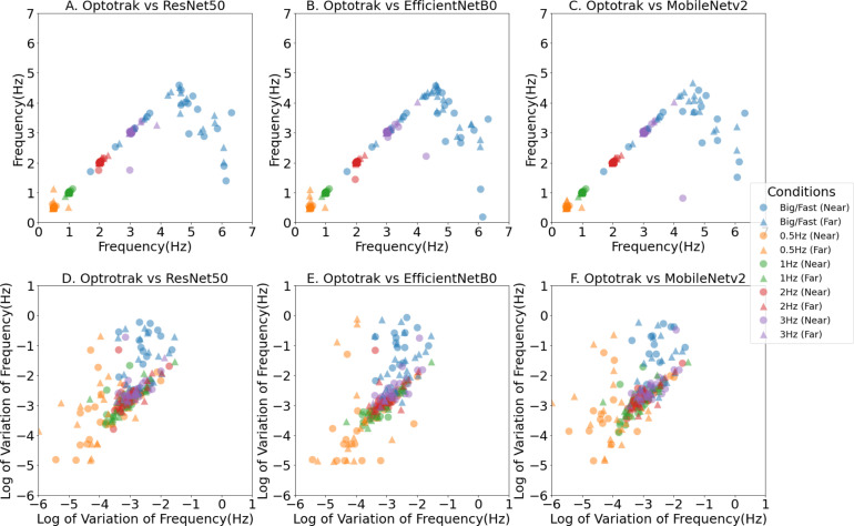
Fig. 6.
Tapping Frequency x–y scatter plot between different computer vision methods (y axis) and the Optotrak method (x axis). A, B and C show the scatter plots of mean tapping frequency. D, E and F show the scatter plots of the logarithm of variation in the tapping frequency. The coloured marks represent the different finger tapping conditions with blue denoting the ‘Big/Fast’ self-paced conditions, and yellow, green, red and purple the externally paced conditions at frequencies of 0.5 Hz, 1 Hz, 2 Hz and 3 Hz respectively. Circles are for conditions performed Near-To-Laptop (60 cm) and triangles are for conditions performed Far-From-Laptop (80 cm).

