FIG 2.
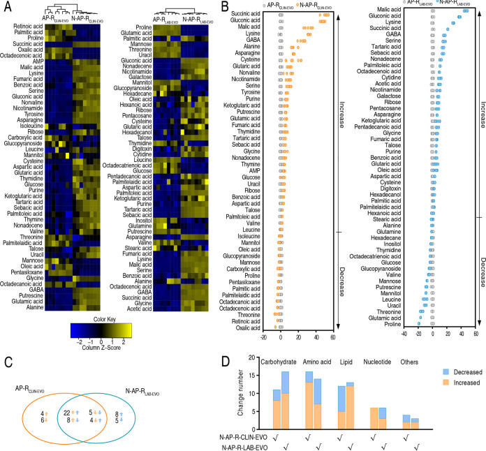
Nitrite-induced differential metabolomics in AP-RCLIN-EVO and AP-RLAB-EVO. (A) Heat map showing differential metabolites. The metabolites are organized top to bottom according to hierarchical clustering. Yellow and blue colors indicate increase and decrease of metabolites relative to the median metabolite level, respectively (see color scale). (B) Z-score plot of differential metabolites based on control. The data of AP-RCLIN-EVO (left) and AP-RLAB-EVO (right) groups are separately scaled to the mean and standard deviation of control. Each point represents one metabolite in one technical repeat and colored by sample types. (C) Venn diagram for comparison of nitrite-induced differential metabolites between N-AP-RCLIN-EVO (yellow color) and N-AP-RLAB-EVO (blue color). (D) Number of differential abundance of metabolites.

